Network visualization tools and software are becoming increasingly popular among businesses looking to gain insights from their data. These tools can help businesses to understand and interpret large sets of data by converting them into graphical representations that are easy to understand.
Data is a useful resource. It enables firms to see patterns, carry out assessments, make wise choices, and establish reasonable objectives. However, even with all the data necessary for success, a business might still fail if no one knows how to use it or understand it.
Many people in an organization outside of the analytics team can perceive datasets as speaking a foreign language. Data visualization can be useful in this situation. Professionals may take raw data and transform it into something simple to understand via data visualization. The definition of data visualization, enterprise network visualization, its significance, and a selection of some of the best tools for business professionals are provided below.
Network Visualization Benefits
One of the key benefits of network visualization tools is that they allow businesses to identify patterns and trends in their data that may not be immediately obvious. This can be particularly useful for identifying potential issues or opportunities that can help to improve the overall performance of a business.
Another benefit of network visualization tools is that they can help to improve collaboration among team members. By providing an easy-to-understand graphical representation of data, network visualization tools can help to facilitate communication and understanding among team members. This can be particularly useful for businesses that operate in complex environments where data is often spread across multiple departments or teams.
Why is Data Visualization Important?

Source: online.hbs.edu
Data is frequently easier to grasp and derive insights from when it is represented visually. As a result, a data visualization is a useful tool for increasing data accessibility within an organization. As a result, individuals may feel more empowered to support their decisions with factual knowledge rather than on, leading to more data-driven organizational procedures.
Data visualization can be crucial in communicating with groups outside of a company, like the press, Network Visualization, government officials, and other stakeholders. Modern business today places a premium on data visualization, and many companies are seeking people with these talents in addition to other data science competencies.
What Are Data Visualization Tools?
The creation of visual representations of huge data sets is made simpler by data visualization software for designers. A designer’s task is greatly facilitated by automating the process of constructing a visualization when working with data sets that contain hundreds of thousands or millions of data points.
Dashboards, yearly reports, sales and marketing materials, investor presentation decks, and pretty much everywhere else where information needs to be understood right away may all employ these data visualizations.
Data Visualization Tools for Businesses
Microsoft Excel (and Power BI)

Source: youtube.com
Microsoft Excel is a spreadsheet program, not a data visualization tool, in the purest sense. Nevertheless, it provides practical skills for data visualization. Given how frequently Microsoft products are used in businesses, you might already have access to it.
Microsoft’s documentation states that you can use Excel to create at least 20 different types of charts with data from spreadsheets. These range from basic options like scatter plots, radar charts, and bar charts to more complex ones like histograms, treemaps, and bar charts.
Google Charts
Google Charts is a well-liked free choice for experts looking to create dynamic data visualizations intended for the internet.
The application leverages HTML5/SVG technology to build charts, making them highly accessible. It can pull data from a variety of sources, including Salesforce, SQL databases, and Google Sheets. Bar charts, pie charts, histograms, geo charts, and area charts are among the 18 different types of charts that are available.
Tableau
For two key reasons, Tableau is among the most widely used data visualization tools available: It is quite strong and comparatively simple to use. The program can interact with hundreds of sources to ingest data and generate dozens of different sorts of visualizations, including charts and maps. Tableau, a product of Salesforce, is a popular enterprise tool with millions of users and community members.
QlikView
QlikView is a data visualization tool that uses associative data modeling to allow users to easily explore and analyze large sets of data. It’s particularly useful for businesses that need to quickly identify patterns and trends in their data.
SAP Lumira
SAP Lumira is a data visualization tool that allows businesses to create interactive dashboards and charts. It’s particularly useful for businesses that use SAP systems and want to integrate their data visualization with other SAP tools.
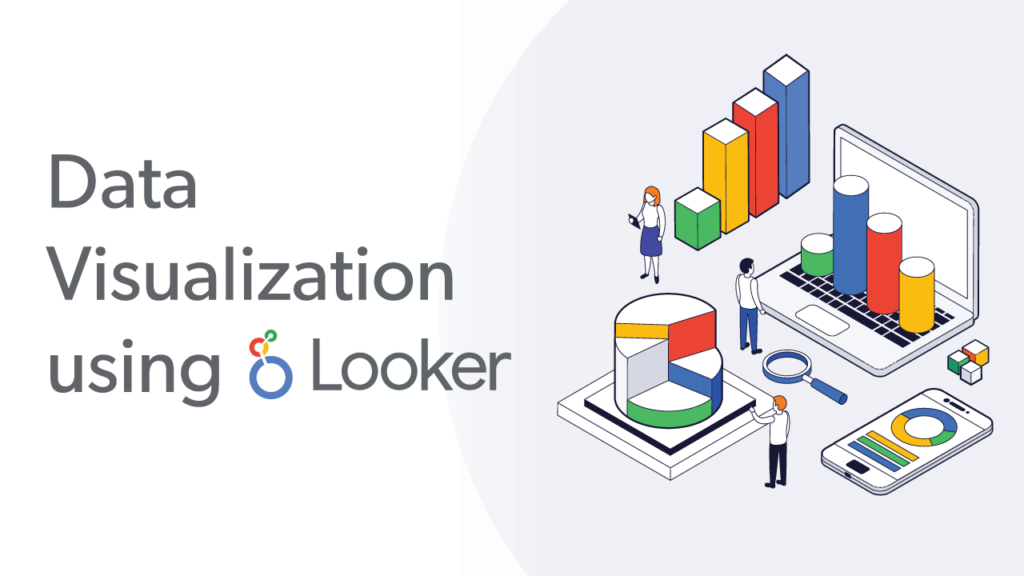
Looker
Source: visualbi.com
Looker is a data visualization tool that allows businesses to create interactive dashboards and reports. It’s a popular choice among businesses that use Looker as a BI platform and want to create complex data visualization.
D3.js
D3.js is a JavaScript library for creating data visualizations on the web. It’s not a standalone tool, but it’s widely used by developers to create custom visualizations for websites and applications.
These are just a few examples of the many data visualization tools available to businesses. The best tool for your organization will depend on your specific needs and goals, as well as the type of data you’re working with.
In conclusion, network visualization tools and software can be powerful tools for businesses looking to gain insights from their data. These tools can help businesses to identify patterns and trends, improve collaboration, and monitor the performance of their operations. By choosing the right network visualization tool for your business, you can gain a deeper understanding of your data, which can help you to make better decisions and improve overall performance.
")

